Bold sayings and two techniques: Fun birthday cards

Hi!

Today I wanted to share with you a set of birthday cards I made using the new Tim Holtz/Stampers Anonymous stamp set 'Bold Sayings' (CMS433).

For the first two cards I used the old embossing diffuser technique in which parts of the embossing folder are left without pressure and the embossing folder pattern is printed only partly. Perfect technique for creating lovely frames for your cards!

My existing Sizzix/Tim Holtz diffuser plates did not have the needed shape nor size for the bold word stamps, so I created my own frame diffuser plate by gluing down three layers of chipboard strips. I checked that the thickness of the frame was quite the same than what the original diffusor plate has. You don't want to make your embossing sandwich too thick!
The center of the frame is measured to match the birthday wishes stamp exactly 😊.

On the first card I also stamped some texture to the background using the new gear stamp from 'Observations' set. The second floral frame card I just inked to reveal the embossed frame pattern.

Once I had finished inking the frame I placed the card on the stamping platform and stamped the text with black Archival. 


The second card set is made in 'CAS - clean and simple' style but with more colours: 

I placed the stamp and the cardstock on the stamping platform and starting from top I masked and inked one row at a time, using different Distress Oxide colours. I love how bright and vibrant those colours are even on a craft colour cardstock!


 While inking I used standard post-it notes for masking the remaining lines.


Once finished I cleaned the ink from the stamp and stamped the text one more time using clear embossing ink. I heat embossed the text with clear embossing powder to create a nice shiny finish on the text.


Before gluing down the card front I splashed some white paint on the card.

I'm so happy to see how lovely but yet different these cards look! One can never have too many birthday cards in stash, right?

Hope these techniques inspire to create your own set of cards. Thanks for stopping by in my blog!

Hugs,


Magical surprises: Card and ATC


Hi!
Stamping masking technique is a fun way to create stamped collages by combining and merging several stamps into one artwork. No special supplies are needed, only a few Post-it note sheets for the self-made masks. Post-it notes are handy for this technique as the sticky edge keeps the mask nicely in place. However, also regular scrap paper can very well be used.

First I stamp the main images on the Post-it notes and cut out. Main images are the ones that appear in the front of the card/tag.

Then I stamp the main images on the card background. I cover the stamped images with the self-made masks and ink and decorate the background with stencils. With the masks still in place I stamp the background patterns and once finished I remove the masks.

 
I usually colour the main images after stamping. This time I used colour pencils for colouring.

All these stamps are included in a lovely Carabelle Studio set 'Etude #1: Femme & Oiseau'. More info available on Carabelle Studio web site:
https://www.artstamp.fr/tampon-a6-etude-1-femme-oiseau-carabelle-studio,fr,4,SA60493.cfm


Thanks for stopping by! Wishing you a nice day!


Observations on painted cards


Hi and happy new week!

Two weeks ago Stampers Anonymous released new Tim Holtz stamps and stencils. As expected, the products inspired me strongly, and I was happy to see that my favourite local seller had some of the items already in stock (Nannan Paperi & Helmi, thank you for a super quick delivery!). I'm hoping that the backorder would arrive soon; cannot wait to play with the 'Inquisitive' and 'Floral Outlines'; they look so amazing, too!

In the same delivery I also got some additions to my Dina Wakley / Ranger acrylic paints collection, so of course I had to take the new paints right into use!


I created two cards with the fun 'Stamp-Paint-Stamp' technique that Tim Holtz introduced on one his live tutorials late last year. Cannot remember how he called the technique, but hope you get what I mean with it:

First I aligned the background cardstock on the stamp platform so that I could easily remove the print and re-position it right in the same spot. The image would be printed twice.

Using black Archival Ink I samped the main image, then removed the cardstock from the platform. I left the stamp untouched on the cover of the platform. (Stamp: CMS434. Observations)
Then I painted the picture with quite thin layers of acrylic paint. I did not worry too much about crossing the lines while painting; the black lines would reappear with the second stamp print.

When the paint was dry I placed the cardstock back in the stamp platform and stamped the image again using black Archival. Love, love, love the result!


I created the yellow tone card first: For the background I used a sheet of white mixed media cardstock that allowed me to splash water on the inked background (I just cannot leave an inked background unsplashed, lol!). For covering the painted face I stamped and cut a mask from post-it notes, and used it when decorating the background with stamping.


The second card I made of a sheet of craft cardstock. I painted the image more loosely as I did not intend to make the gentleman look too realistic anyway. For decorating the background I reused the same self-made mask and stamped the background with the gear stamp, leaving some areas blank.


I'm really happy with both cards. Now my head is already buzzing of how I will use the image on an art journal page....!


 Thanks for stopping by. Hope you like my creations!


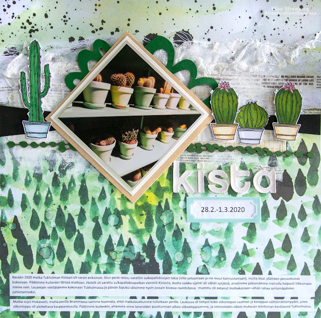
Scrapbooking layout: Kista


Hi!

Since the beginning of 2021 I've had the great pleasure and honour to cooperate with an amazing craft supply manufacturer, Carabelle Studio. I've been a huge fan of their stamps for years; their large selection of stamps and stencils designed by my favourite designers (Birgit Koopsen, Kate Crane, Ana Bondu, Azoline, Jen Bishop to name a few) have taken me to their webshop several times during the past years 😀. 

Good quality photo polymer stamps are nice, but personally I prefer working with rubber stamps. With Carabelle I love the fact that their rubber stamps come mounted; I hate working with the sticky mounting foams and getting the stamps mounted and ready to go saves me a lot of time and trouble.

Carabelle Studio designers and DT members projects are shared on Carabelle Facebook page *here*. Our fan page is in Facebook, too (*here*); we're all looking forward to seeing your creations! The fan/community page is called Les Cara Friends 💓

Sorry for the long introduction; can't help that I'm so excited for being part of the design team! 😀

This scrapbook page is not just about highlighting the lovely Carabelle stamps (even though the cactus stamps are quite yummy!). It is about documenting a very strange weekend I spend in Stockholm with my family early March 2020. Who would have known that after a few weeks we would enter the new Covid pandemic era and countries would start to close not just their borders but also their restaurants, bars, hotels, shops etc. Very little did we know then; our Sweden trip had other types of obsticles...

The purpose of this trip was to cheer and support our son in his international badminton tournament in Kista, Stockholm. We booked flights and a big hotel room for the entire family and were really looking forward to a nice weekend together. 

Then the tournament got cancelled, just before the weekend.

Our tickets were non-refundable, and even if Kista probably wouldn't have been my first choice for a family weekend in Sweden, we thought that it would still do. It's only a short metro ride from down town so all Stockholm attractions would be easily reachable anyway.

I've travelled quite a bit and my family is somewhat experienced in that area, too. Yet I want to simplify things to the extent possible: I knew that in the Helsinki airport we would have to walk a bit to the gate and for making the transfer easy I checked in our small cabin-sized luggages. 

We had not heard nor read that the ground staff was taking some strike actions, nor did the check-in clerk say anything. We were at the airport well on time early Friday afternoon, so I was quite surprised to realize in Kista that our luggage did not make it. Most of the peoples' luggage was onboard; only a handful of passangers did not get the bags. We included.

Reporting the issue took a while, but eventually we got into the taxi and drove to our hotel. Luckily the hotel (really nice one!) was close to a shopping center so we could buy some necessities for the night and the morning. We were sure the luggage would arrive in the morning as there are many of flights between Helsinki and Stockholm late evening and even early Saturday morning.

To cut the long story short: The luggage did not arrive. After returning back home we learned that the bags were delivered to Stockholm right after we returned home on Sunday. One week later they had travelled back to Helsinki and we finally got them back.

On Saturday morning in Kista we had a lovely breakfast at the hotel and decided to make the best of our stay anyway: We visited all the sights we had planned and as my husband was celebrating his birthday we had a lovely birthday dinner in the city Saturday evening. I did not care that we were wearing old jeans and sweat pants; it just was what it was 😀

As a frequent traveller I filed a claim after our return home and I got a nice refund from Finnair. The unfortunate thing is that the flight voucher is still unused as Covid has stopped all our travelling. Well, there's still a few months left to use it; maybe we'll get a chance to make a revisit to Stockholm later this year.

As mentioned, the hotel was really nice and trendy with a really friendly staff. The cactus picture is taken from the hotel lobby.

Quite an adventure, thanks for reading the story!

Hugs,


Scrapbooking layout: Hello summer!


Hi!

We have a small crabapple tree in our garden, and it blooms beautifully every year. It has become our tradition that I take pictures of my daughter infront of the blooming tree. The full bloom lasts only for a few days, but it is soooo beautiful!

And as a result I have a precious collection of flower-rich memories!


This scrapbook layout was all about mixing different patterns, loving all the bright colours and including some fun little details on the page. Scrapbooking with a lot of joy, without too careful planning. 💓

The background paper is a Mima Molina design for ABstudio. Love it!


I guess the layout title says it all: Hello Summer! I'm so happy you're here!

Wishing you a lovely day,


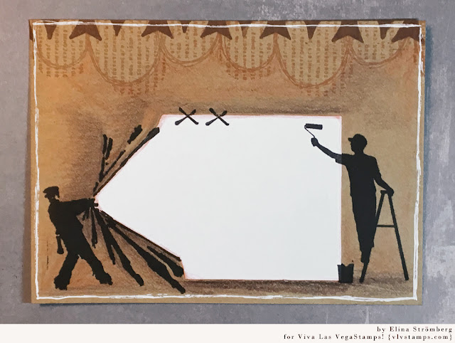
Mail Art with VLVS! Banksy stamps

 
Hi!
When creating projects for Viva Las VegaStamps! I decorated my very first mail art envelopes. I loved the idea of sending a letter or a card to someone but at the same time using a decorated envelope, a true piece of art for wrapping the letter. I know I would love to receive a mail art envelope in my mail!
 
This mail art project I started from the receiver address area:

With a help of a stamping platform I first stamped my two main images on the craft envelope. I left the stamps on the platform, and re-stamped the images on a white paper.
 

Then I cut out the address label from the white paper, following the stamped lines on the left side. I glued the label on the envelope on top of the stamped images.

Then the only remaining thing was the decoration: I stamped some patterns on the top of the envelope, and here and there added a bit of color with color pencils. The background needed a hint of white, so I traced around the edges with a glue pen.
I think the envelope looks quite nice! 


Aren't these Banksy stamps just the coolest!

Wishing you an inspirational day!


Yellow on scrapbook page with BG


Hi!

When it comes to patterned papers one of my true favourite companies was BasicGrey. Luckily I still have some supplies left, so while waiting and wishing for their business restart I still can create a few BasicGrey projects :)

Sometimes it happens that when you store your favourite piece of paper for very long (as it is too precious to be cut and used) you eventually realize that your taste and preferences have evolved over time and the pattern actually looks rather dated and boring. This happens very rarely for BG designs; their patterns and choises of colurs are so timeless!

Do you still remember the 'Mon Ami' BasicGrey collection by Kelly Purkey? Do you have some favourite collections which you remember well and like even after years of publishing?

Hugs,